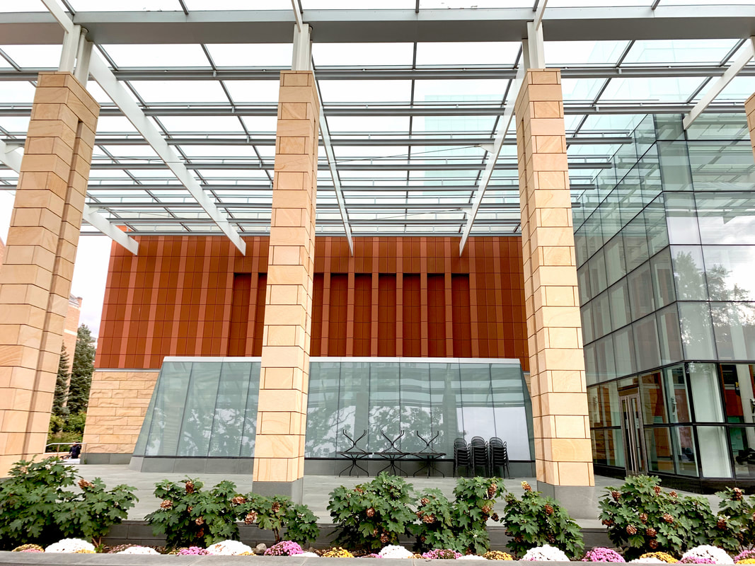
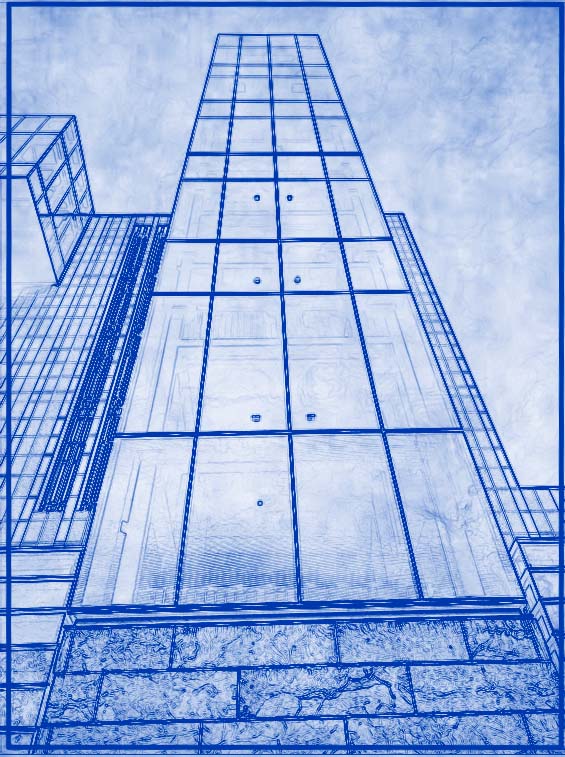
Columns |
Rows of Music |
Patterned Entryway
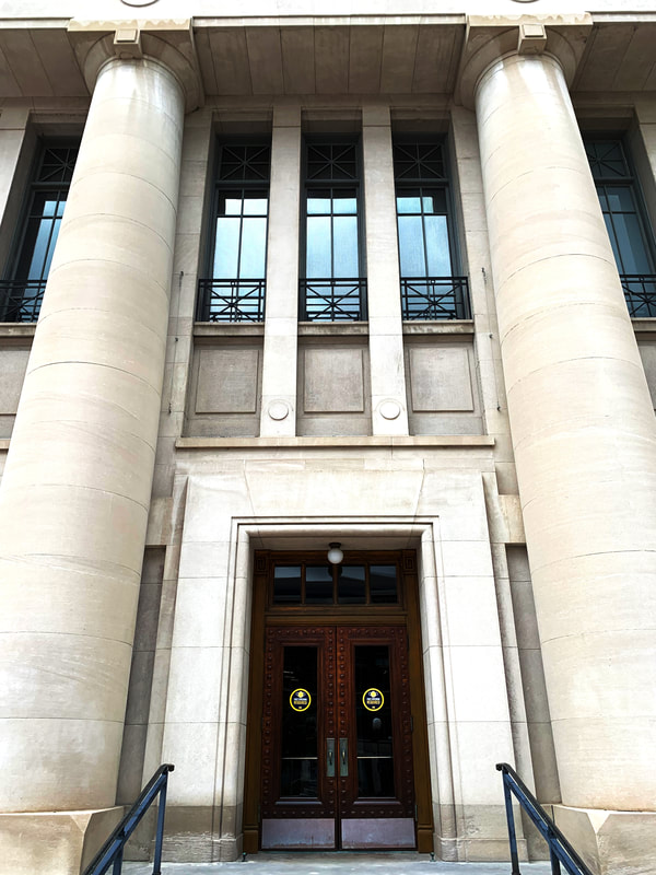
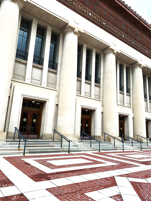
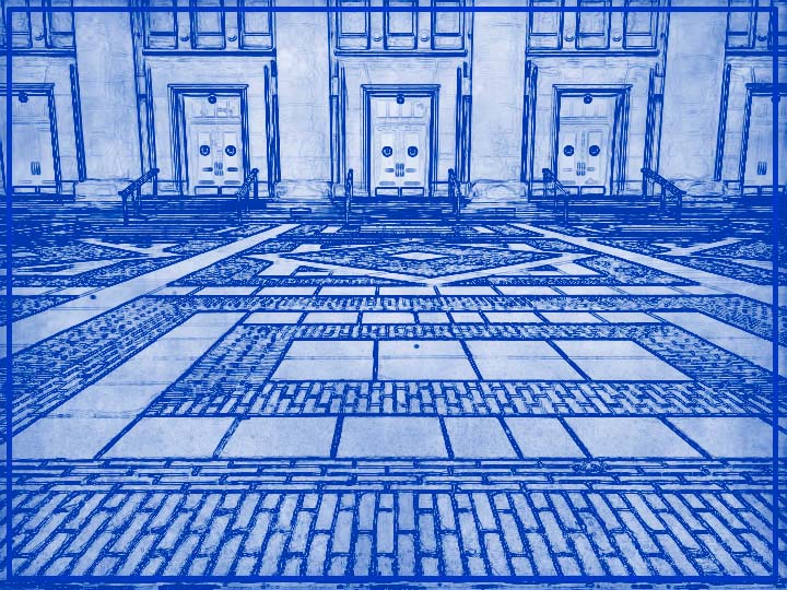
I really loved this building, and I tried my best to take this best pictures of them. Of course, the first picture was tilted, and even when I straightened it as best I could, nothing could help it once I put it next to my second picture, which is purposefully tilted. The third image is also off somehow. But when I increased the brightness to show the different shades of the white, got a great outline of the doors in my blueprint, and saw how nice the reflections on the glass look, I felt like my hard work had pulled off. I like the symmetry of the doors, and the balance of the dark red floors and roof on them. This is actually my second artist statement of this. I finished the first one, but when I tired to publish the whole thing reloaded, asked me to log in again, and deleted what i had written in the process. So I redid it, this artist statement.
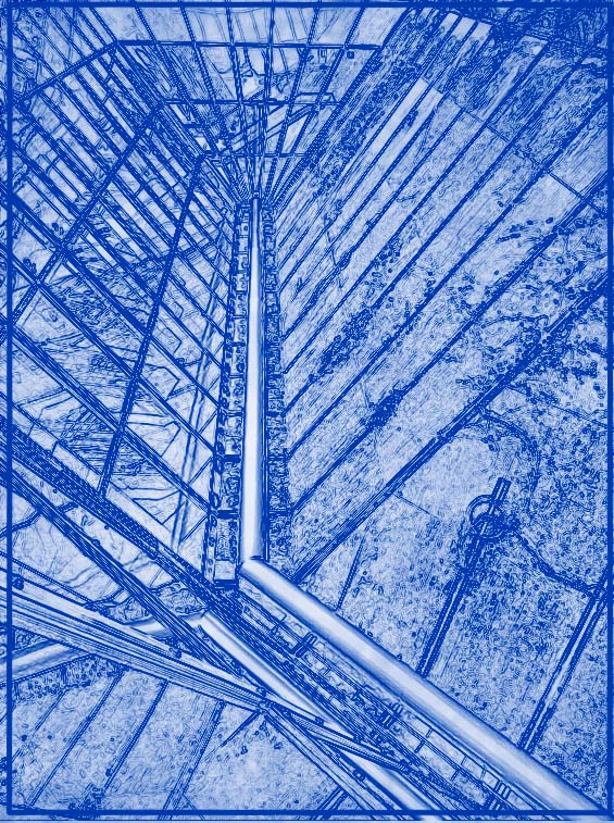
A Train towards the Future |
Apocalypse Courtyard |
To the Highest Peaks
This was the first building I went to. It had so many parts, but I wanted to keep a central theme to show they were connected. I chose futuristic. The first one turned out better than I had dreamed of when I put the blueprint filter on it because it showed a faint outline of the stuff inside, like the phantom people who will come once the building is built. The tilt of the second one makes it look like a train, like it is moving. I had problems with it being blurry, but in the end it turned out okay. The third one was by far the hardest. The orange looked ugly no matter what. I ended up decreasing the brightness and then using the dodge tool to brighten the darker parts of the background. In this set, To the Highest Peaks is my favorite, but all turned out very good.
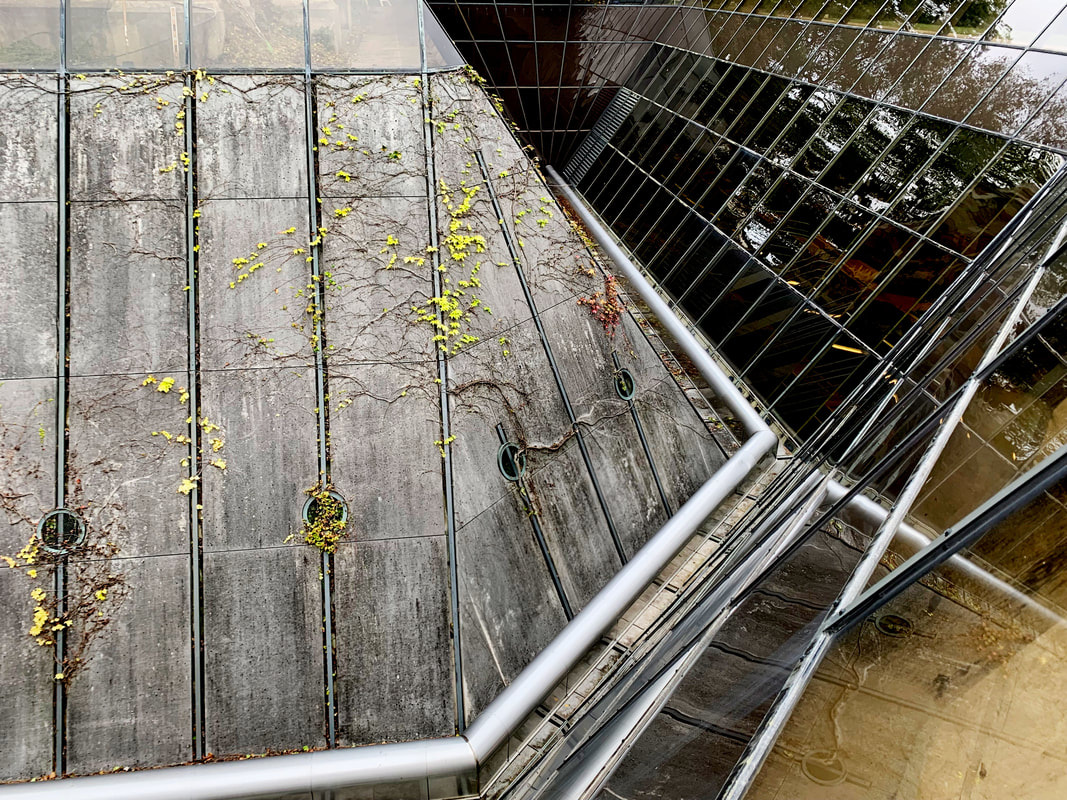
Turns and Reflections |
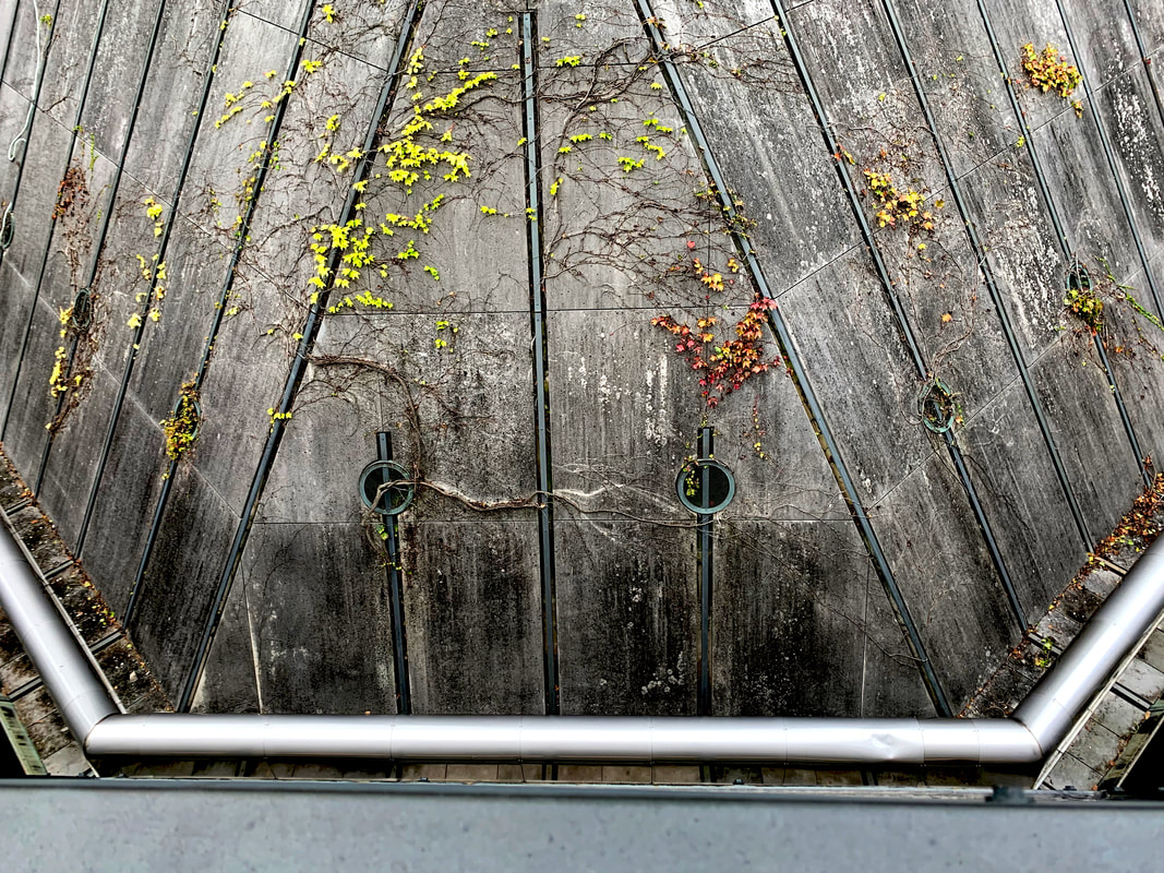
The Monster in the Concrete |
Glassy Ditch
This one is sort of odd, but it looked really cool so I took a lot of photos of it. The glass makes the turns look awesome, which is why the first picture is my favorite, I like the blueprint as well, all the straight lines look great. I was unsure about the second one, but when I added contrast between the clean top half, dirty bottom half, and spotless pipe, it looked great. I had to choose to show what was through the glass or make it dark and mysterious. I chose the second, and I don't regret it. They all look great.
Approaching the Gates |
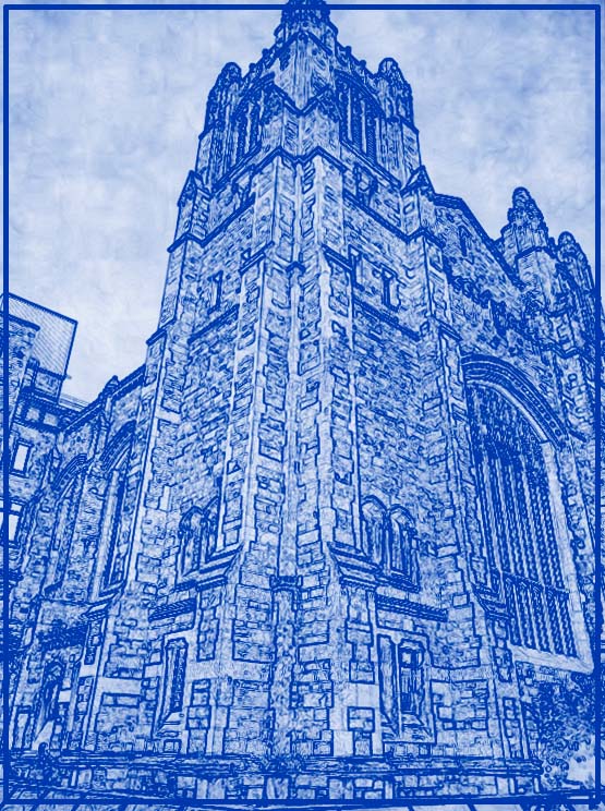
Reaching for the Sky |
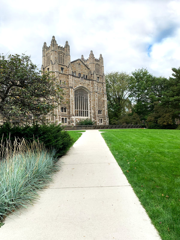
Palace of God
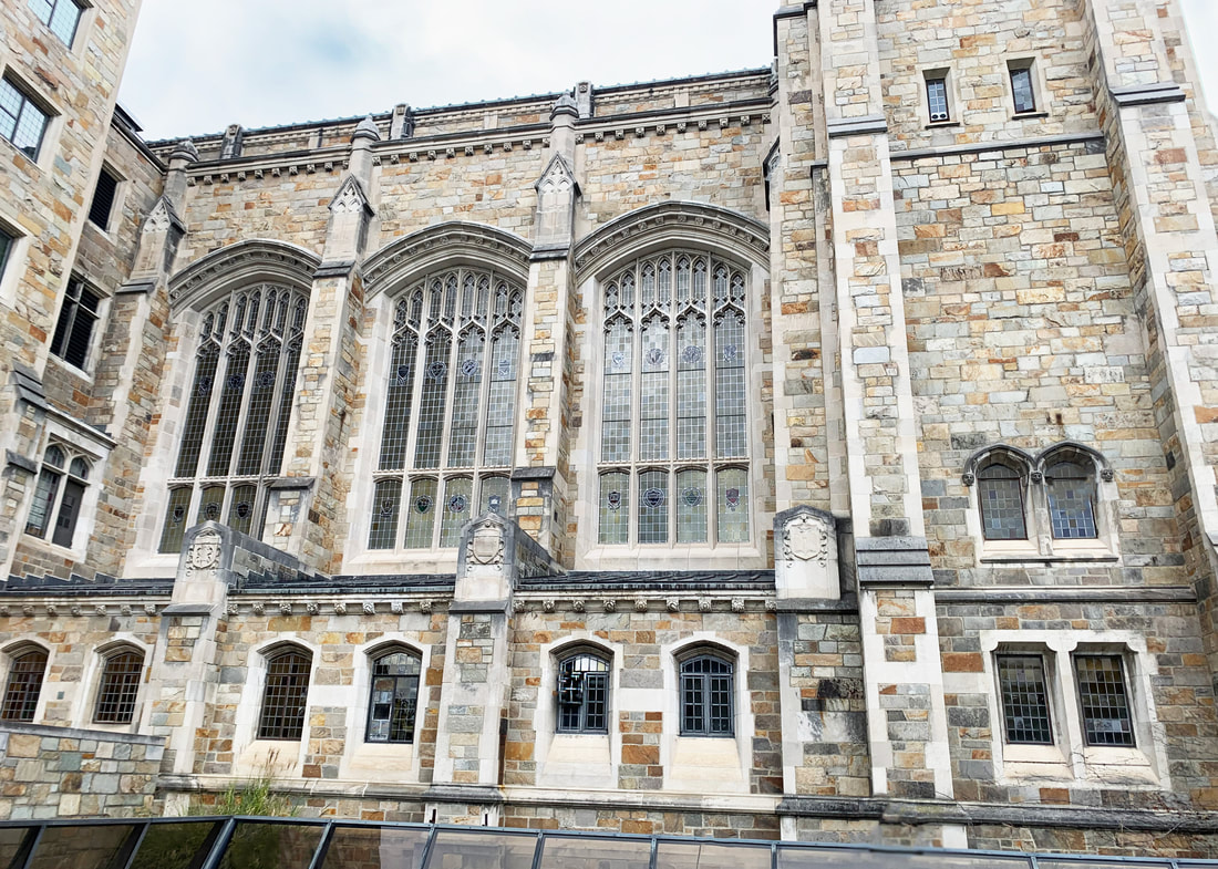
When I was approaching this building, I noticed the sidewalks were designed to make the building looks its best. And it did look really cool. So I took my first picture. I knew I wanted to take a picture looking up, and in my second image, I loved how it focused on one area to look like a tower. And so many bricks looked lovely with the blueprint filter. On my third image, I was a little unsure. It looked very busy, and I had to crop out some man made things that I worried ruined the old fashioned vibe. But when I increased the contrast it looked great, and I like it. And the other two I loved. The names all come from the fact I am pretty sure this is a church.
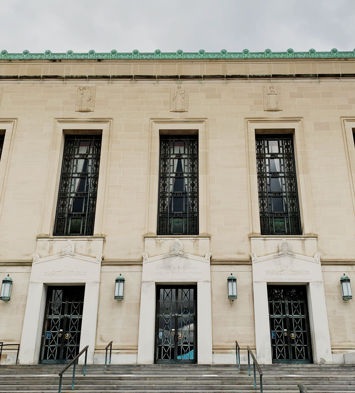
Empty Windows |
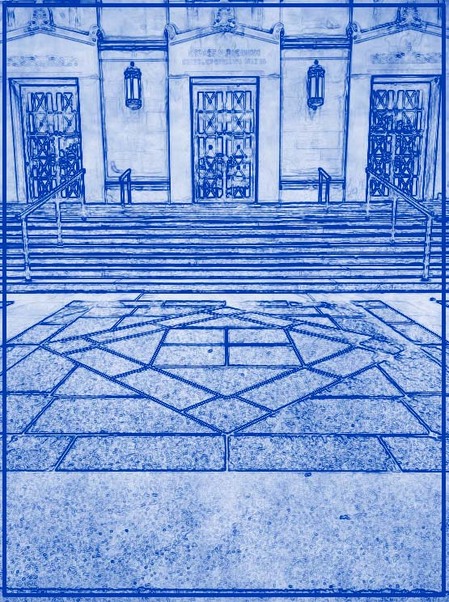
Three Doors |
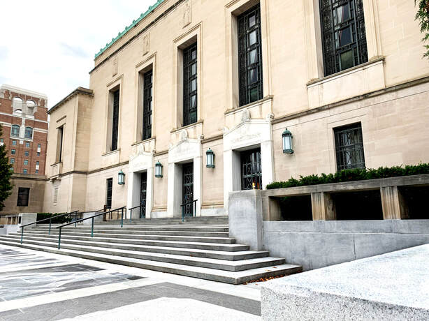
Watching For an Open Door
I was trying to take photos of something across the street from this, but it was a bad building for it. Luckily, I had noticed this building too. I liked the green roof a lot, and the patterns on the floor. When I saw a concrete slab to the side, I thought it would be cool to try to take a photo from there. Unfortunately, when I went to edit I discovered a lot of my photos were crooked. I managed to fix them, but it still looked really weird on the blueprint one, so I ended up redoing the entire frame part of it. They all turned out really cool though.
